The Presidential Office’s website will be completely redesigned at 10 p.m. Monday, with an updated look to better represent Taiwan’s diverse spirit and meet the needs of modern users.
The design concept, based on the idea of “The People’s Presidential Office”, took more than half a year to complete and aims to convey Taiwan’s multicultural identity while demonstrating its power internationally. Founder and design director Li Ming (李明) said the brand identity and website revision are like creating a new business card for Taiwan.
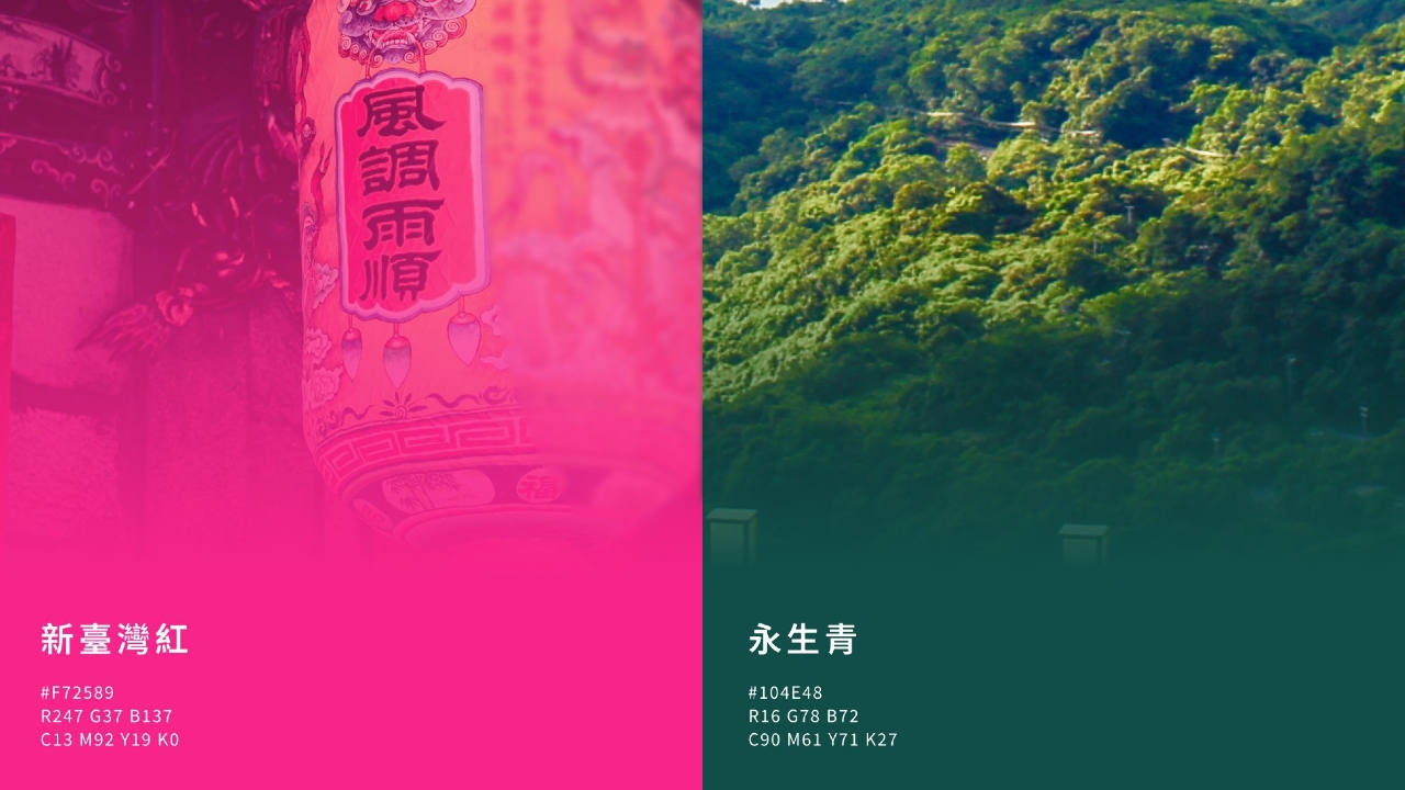
The design itself integrates concepts of the Presidential Office building including its red bricks, windows, and roof design. Elements of the graphic represent “the strength of everyone”, showing the common values of cultural heritage and tolerance. The colors, “New Taiwan Red” and “Evergreen”, signify Taiwanese people’s pursuit of a better life, as well as their connection to the beautiful natural ecology of Taiwan.
The inner pages of the website are organized in a stable and upward structure, emphasizing the balance between history and modernity of the Presidential Office. Every element of the design is meant to display “people as the main body” of Taiwan.
The design also hides interactive Easter eggs called “the five chiefs”, representing the president, vice president, secretary-general, and two deputy secretaries-general of the Presidential Office. If web visitors light up all five, it symbolizes all parts beginning to work together within the Presidential Office.